Climate Perception
(statement for The Sustainability Compass N, E, S, W exhibition at the 2023 Louisville Sustainability Summit)
Sustainability, as the direction we must choose, encompasses Nature, the Economy, Society, and ultimately Well-being. Well-being includes ourselves, our animal brothers and sisters, our plant friends and the systems of the Earth that sustain all of us.
At the base of our choices lies perception filtered through our experience. We perceive with our senses the change that nature provides through the seasons and the years. Our intelligence has created means to record our observations and our science allows us to extend our senses. We can sense temperature, observe fire, observe water levels, then we record that knowledge to transmit. Economic data we also record, so we can know how much oil we’ve pumped, wind power created, and gasoline used. We enhance our senses to record what we can’t see: the atmospheric carbon dioxide which is driving change.
Climate-related data are collected by various groups and distributed freely on the internet, if you know where to look. Charts and tables of numbers register to trained specialists but provide little insight to everyone else. Transforming data into graphical elements for visual art generates a very specific messenger. Outward spirals denote increasing quantities (i.e., atmospheric carbon dioxide), seismic-like lines denote fluctuating quantities (i.e., sealevel), more or less level lines denote static quantities. More can and should be made of these data but transforming them into a visual element shouts their message at a glance. For most of these more than a glance is needed, though: the QR code leads to more insights.
We commonly express our perception at a higher and more composited level than scientific data. In our living memory what has changed? No one person has seen all, but society has collectively. Ask the snowboarders, bird watchers, hockey players, grandfathers, life-long residents, park rangers to speak of impacts to society and well-being. They speak alongside the voice of commerce and the voice of nature itself.

Follow this link to listen to some things that were known in 1982.

Follow this link to listen to some ordinary people’s perception of climate.

State Highway 39
World oil production went from 0.15 billion barrels in 1900 to 29 billion barrels in 2021. The spiral in the photograph does not uniformly increase as there was a downturn in oil production in the 1980s, followed by continued increases afterward. These features are better seen in the traditional plot of the data. See Hannah Ritchie, Max Roser and Pablo Rosado (2022) - "Energy". Published online at OurWorldInData.org. Retrieved from: 'https://ourworldindata.org/energy'


Casper Wyoming
The United States accounts for 4.19% of the world’s population and 16% of the world’s energy usage. A conventional plot of the data shows how the world’s energy consumption has increased dramatically relative to that of the United States, since 1970.
BP Statistical Review of World Energy June 2022, http://www.bp.com/statisticalreview and https://www.energyinst.org/statistical-review. . See United States Census Bureau Population Clock https://www.census.gov/popclock/ 10/9/2023 8:30 PM.


Western Oklahoma
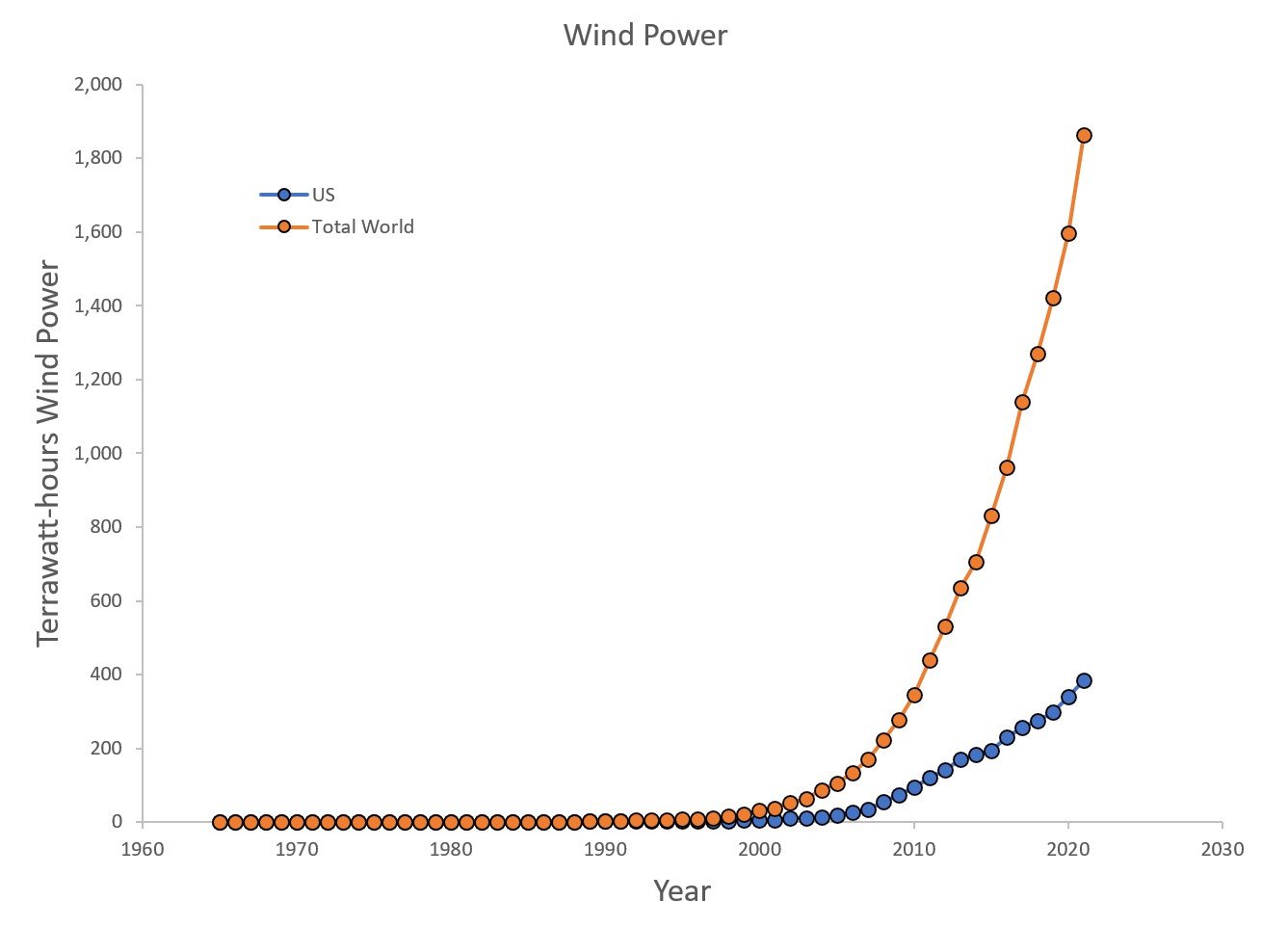
The United States accounts for 4.19% of the world’s population and 20% of the 2023 world’s renewable wind power generation. See United States Census Bureau Population Clock https://www.census.gov/popclock/ 10/9/2023 8:30 PM. Also BP Statistical Review of World Energy June 2022, http://www.bp.com/statisticalreview and https://www.energyinst.org/statistical-review.

Wynnewood Refinery
United States gasoline refining and blending data consistently shows seasonal patterns in gasoline use and a steady increasing trend until the Coronavirus pandemic. Prouction dropped dramatically in 2020 and has not yet returned to the prior highest levels. See U.S. Energy Information Administration (EIA) https://www.eia.gov/petroleum/data.php. Follow Refining and processing, Weekly production, Refiner & blender.

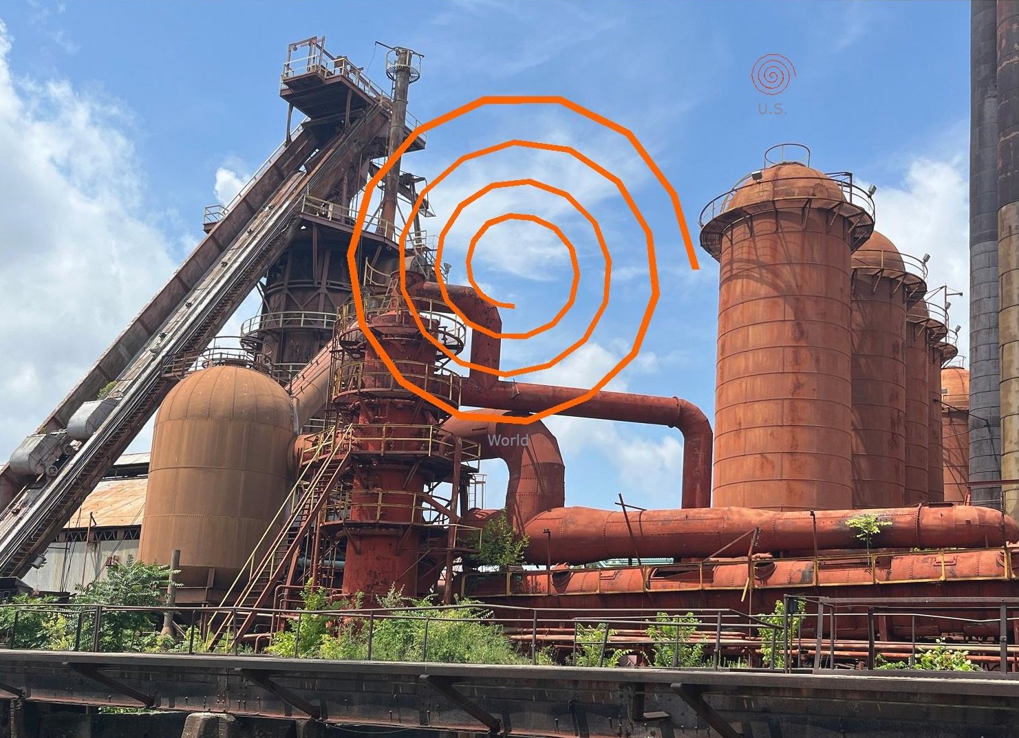
Sloss Furnace
From 1965 to 2021 the world emissions of carbon dioxide increased from 11,193 to 33,884 metric tons. The U.S. share dropped from 31% in 1965 to 13.8% in 2021. For reference the U.S. represents 4.19% of the world’s population: world population--8,002,788,584; U.S. population-- 335,554,916. A conventional plot of the data show that the world’s emissions have increased dramatically relative to that of the United States since 1970.
See: BP Statistical Review of World Energy June 2022, http://www.bp.com/statisticalreview and https://www.energyinst.org/statistical-review; also United States Census Bureau Population Clock https://www.census.gov/popclock/ 10/9/2023 8:30 PM.


Data from Mauna Loa and other observation stations in the pacific show atmospheric carbon dioxide increased from 1958 (316 parts per million) to 2022 (419 parts per million). Seasonal trends in the data result from plants in the northern hemisphere removing carbon dioxide during the growing season and plants and soils releasing it in fall, winter, and early spring.
See Scripps Institute of Oceanography, https://gml.noaa.gov/ccgg/trends/, https://scrippsco2.ucsd.edu/, and https://scripps.ucsd.edu/news/coronavirus-response-barely-slows-rising-carbon-dioxide.
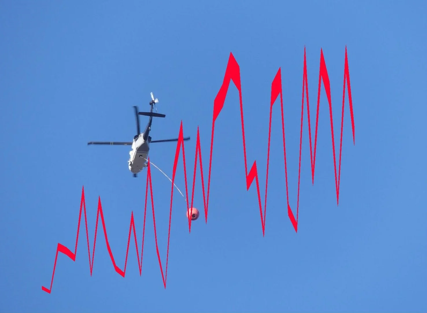
Flyover in Honor
of Frontline Workers

Santa Fe
Fires were burning around Santa Fe, NM in the summer of 2022. National data from the National Interagency Fire center shows higher acreage (as much as 10 million acres per year) after 2005 than from 1980 to 2000.
See https://www.epa.gov/climate-indicators/climate-change-indicators-wildfires, then the wildfire extent tab and National interagency Fire Center Data.

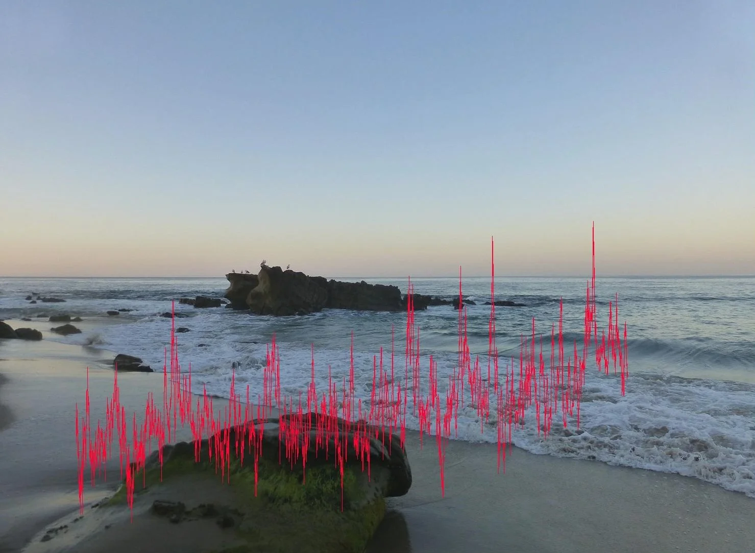
Pacific Ocean
The image shows a view of the Southern California coast with superimposed mean sea level data. Because it is plotted with no scale, the change appears large. But how large? National Oceanographic and Atmospheric Administration (NOAA) data show that the sea level at Los Angeles has risen by about 1 mm per year over the period from 1923 to 2023, which amounts to about a tenth of a meter or 4 inches in 100 years. See https://tidesandcurrents.noaa.gov/.

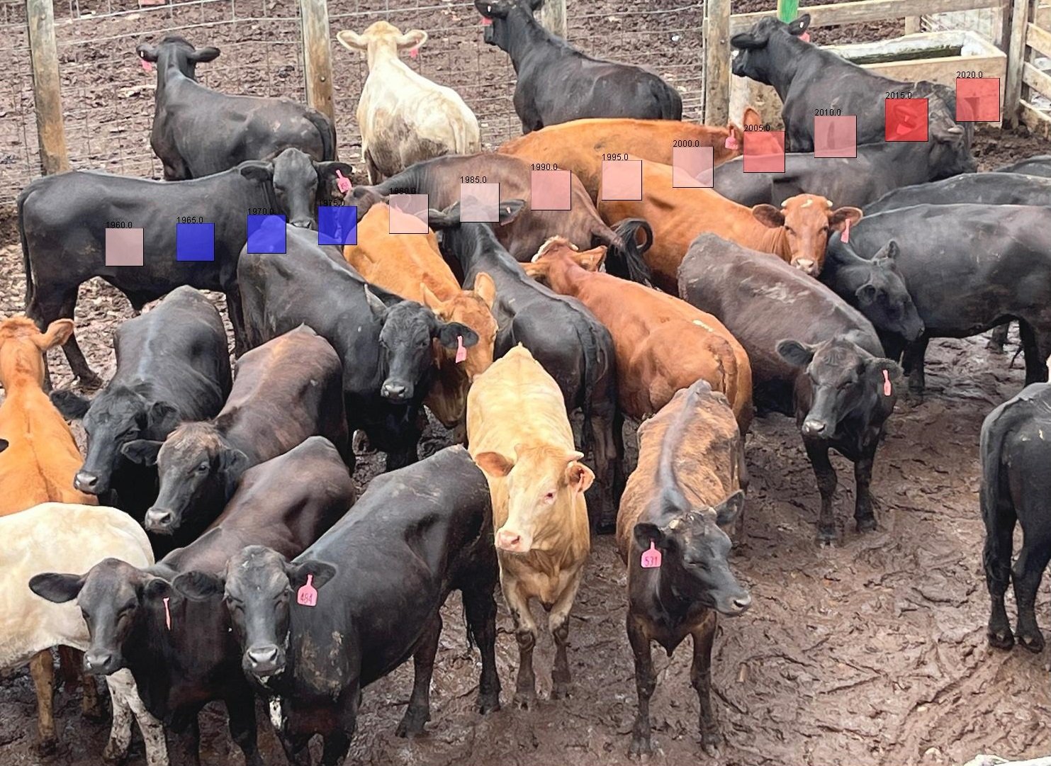
Oklahoma City Stock Yards
The level of carbon dioxide in the atmosphere is indicated by the series of boxes which rise from left to right. They are sized by the atmospheric carbon dioxide level which has increases from 316 to 424 parts per million from 1958 through the present, but the difference in size of the boxes is hard to see on the photograph. The colors of the boxes represent the deviation of temperature from average, blue is lower, white the same and red is increase.
See Scripps Institute of Oceanography, https://gml.noaa.gov/ccgg/trends/, and https://scrippsco2.ucsd.edu/.
